
In the “Do Libraries Innovate” debate at ALA, one of the points that Stephen Abram brought up (about 11 minutes in, if you want to listen to the podcast) is that libraries are terrible at relaying our successes. We have individual innovators, but the ideas don’t diffuse. I’m not sure where the problem is – are there too few channels of communication? Too many?
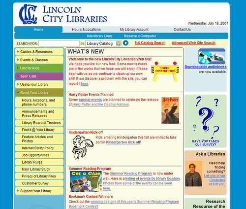
I thought of this recently, when I saw the newly redesigned Lincoln City Library Website for the first time.
[disclaimer] I feel that I should insert a few caveats here. I’ll be very up front and say I wouldn’t mind working for Lincoln City Libraries after I graduate. I don’t mean to finger point, I’m just trying to use an example to illustrate a point- I fully realize that I know little about what went on in the redesign, I don’t even know how long it has been in the works. I don’t know how the vendor was chosen, or if the libraries even had a choice. I also am fully aware that many of the bugs I mention will be fixed soon – this is, after all, a short time after launch. If I’m way out of line, PLEASE let me know by commenting or emailing me (karin@nirak.net).[/disclaimer] Thanks very much to an anonymous contributer for their help!
My immediate reactions to the site:
- The new site design breaks some links. The old links for “hours and locations,” “heritage room” “frequently asked questions” and more are broken. Of course, this can be fixed with a redirect, but I question as to why they were changed at all.
- I don’t find the site particularly attractive, and at this point, it’s somewhat quirky.
- There is a missed branding opportunity. The site is fairly generic, it does not say anything about Lincoln City Libraries.
- There are lots of errors on the page. This is pretty inexcusable when they’re so easily found – Most of the errors can be fixed in minutes with a well known programs. While it’s true that it can be hard to get rid of all errors, many of these are very simple changes (changing the doctype or case of elements, for instance.).
- The navigation is confusing. Some items are repeated. The expanded lists don’t always stay expanded, even when you click in the same section. Many navigation links lift you completely out of the template, which is disorienting.
- The code is just messy. It’s a fairly universal rule in (good) web design nowadays to style the HTML elements that are already there whenever possible, rather than adding lots of new classes. This not only makes the code leaner (and faster loading) but it has a host of accessibility advantages.
These are all little things, in of themselves, but they add up to a disorienting experience for the user. Today’s Internet users have little patience for such frustrations, and will go somewhere else rather than put up with them.
Custom CMS?
The company hired to do the web development – Quick Connect Web Services in Lincoln, says they developed a CMS [Content Management System] for Lincoln City Libraries. “The content management system we developed for LCL allows them to update their site when they need to, in an easy and straight forward manner. There’s no waiting for the “web guy” to do it.” I sincerely hope they did not build a CMS from the ground up when there are many options already out there, many which are free and open source. If they did develop from the ground up, that’s an incredible waste of resources and money. There’s a good chance that they just altered a CMS system that already existed, and if they did, I hope they used a free and open source system like Joomla or Drupal. This way the library will have much more flexibility if they ever need alterations made, updates to the CMS will be free, and the software will be community supported.
It’s no secret that I am a big open source geek, but in this case, it really makes financial and business sense- start with open source, and if something goes wrong, you’re not locked into one company for improvements and fixed. Libraries should demand this at the outset of any new project.
Where are the new features?
Quick Connect Web Services has an impressive list of new features to the new Lincoln City Library website:
- Add, edit, and delete pages whenever they need to using an online text editor similar to Microsoft Word
- Each page can have a different template using any of the three templates we developed for each section of their site
- Pages can be public, or protected so only staff can see them
- Organize content into categories and with tags
- A customized blogging platform
- Visitors can comment on blogs and the comments are “threaded” to facilitate discussion
- Promote books on different sections of the site
- RSS Feeds for their blogs
- Update their site navigation
It’s a very nice list, but I hardly see any of this. I can’t find an RSS feed or a blog. I have seen a few email forms, but nowhere can I leave a comment. I’m not sure if the tagging of content refers to the front end (users) or back end- it sounds like a great concept, though.
In the end, this site looks exactly like what it is- the same old site, shoved into a new design. Very little thought has been paid to the content, navigation, usability, or what the user will actually use the site for. There’s no integration with the ILS (which I realize is a whole other beast and outside the aims of the project, but there’s not even the illusion of integration- you’re taken to a completely new site).
What’s better?
I’m sure everyone is sick of being compared to Ann Arbor District Library – Sorry, but if you’re releasing a website nowadays, it’s gonna happen. However they did so much right in comparison, even leaving out their amazing integration with their ILS. The design is subtle and sophisticated. Their blog (actually, an aggregate of several blogs) is the first thing you see, and comments are enabled. Staff in the library respond to comments and interact with community members. There is high quality photography and *gasp* nary a clip art in sight. The navigation is clean and consistent.
Ann Arbor isn’t the only example- The Library Success Best Practices Wiki lists other examples of good library website design. Looking through the list, though, I see a lot of the same mistakes. Lincoln City Libraries certainly aren’t alone.
Suggestions for improvement
Why should I care if the Lincoln City Library has rolled out a nice, generic website? Because I see the potential for much more. Much of the potential is not lost- with some tweaks, the current website design can work. Here are my suggestions for an improved user experience.
1. Carefully consider navigation.
Navigation should not contain every page on your website. This leads to too many options- the point of navigation is to narrow the options.
The problem is, designing the navigation is hard. Possibly the hardest thing you’ll do in the entire process. It’s not just picking a few topics and filling in pages- it’s about thinking conceptually about what you want your site to accomplish.
The current navigation contains duplicate items and is generally confusing- and to top it off, many of the links take you out of the navigation completely, which is disorienting. Links that are part of the main navigation of the site should never take you out of the template.
Think carefully about how you use the promo area on the right side bar, and whether you need that area at all. Three columns can be confusing.
2. Get rid of clip art, add photos.
The under construction graphic, the question marks, and other images make the site seem thrown together. There’s no need for an under construction graphic, just say the site is new, and direct users to the comment page if there are errors.
Instead of clip art, try doing a search on creative commons pictures on Flickr, or use a free stock photo site. Make photos as big as you can while not distracting from the overall look.
Lincoln City Libraries have many wonderful, photogenic features: show them off!
3. Add interactivity.
So you can add blogs now? Do it! Give your home page an RSS feed so I can see when there’s new content. Give me options as to what new content I want to subscribe to – Book talks? New books? Kid’s activities? Round up a few employees interested in writing for the web and let them work on a blog.
According to the homepage, they’re working on “Some new features are in the works that we hope you will enjoy.” – I hope this is it!
4. Adjust the colors.
I know you’re going for bright and fun, but the website is BRIGHT. I recommend changing the bright blue background color to a more subdued color- this will be easier on the eyes, and will bring the main content into focus.
Text Colors: The text on the home page does not need to be red. The link colors could use some thought, and should be consistent.
5. Add redirects:
Make sure there are no dead links. Here are some that are likely to have been bookmarked and are now dead:
- lincolnlibraries.org/info/hours.htm
- lincolnlibraries.org/info/faq.htm
- lincolnlibraries.org/hr/front.htm
- lincolnlibraries.org/depts/ys/front.htm
- lincolnlibraries.org/depts/ys/ya/front.htm
- lincolnlibraries.org/depts/ys/parents.htm
- lincolnlibraries.org/webliographies/genealog.htm
6. Try to integrate the ILS into the site.
I don’t know how much you can change, if it’s template based or what. Perhaps this may mean using dreaded frames, just to maintain some consistent navigation. (any other ideas? Their ILS appears to be Horizon Information Portal 3.08_RC1_57.01.)
7. Add pictures of librarians.
There are rotating pictures of librarians in the “Ask a librarian” box on the main page- that’s nice, but I can’t find anywhere else where I can get pics or bios of the staff. Let the public get to know you!
8. Add multimedia.
To start, put your library promo spot on YouTube and embed it somewhere. Perhaps you could have a multimedia page somewhere- it’s an easy way to add a little something extra to the site.
My redesign
Here’s an idea of what an alternative website might look like – slightly subdued colors, more photos, picture of the library across the top. This is just an idea of an alternative, it is by no means what I think the site should look like. (Also, I didn’t spend too long on this, just tried to flesh out some ideas)

Image credits:
Well, I think LCL should hire you based on your version of the redesign!
Thanks!
Great job, Karin! I agree that LCL needs to hire you, at least on a consultant basis. Of course, they couldn’t pay you enough.
Wow, that’s a really great in-depth analysis. I think this is the sort of attention every library should give their Web site.
Our library system had Steve Krug, author of “Don’t Make Me Think” (about Web usability) come do a workshop with our libraries a few months ago. He really did a lot of the same sort of analysis that you have done here. It was interesting to see how many of the workshop participants just hadn’t thought of those things before. Like navigation, and the use of “library jargon.”
And he really focused on usability testing… a concept that had never really occurred to a lot of the folks at the session. What? Ask your users to give it a try and tell you what works and what doesn’t???? Try things out and don’t be afraid to make little changes to make it more user friendly???? Design your site for your patrons instead of trying to train your patrons to use your interface???? Unheard of! :)
Great job addressing some of the underlying assumptions that tend to affect online commercial sites and thinking of practical ways to address Web site problems. You’ve really hit the nail on the head with some of these suggestions, I think.
Pingback: nirak.net - Musings of an LIS Student » Kudos to Lincoln City Library