
Over the last year, the way I design websites has changed pretty dramatically, and I decided to write about my process here. This isn’t a complete start to finish write up on designing and developing for the Digital Humanities – Jeremy Boggs covered that pretty well (parts 1, 2, 3 and 4 – go read them). I realized after I was done writing this post up that it directly contradicts many things I have read about project management/design (including Jeremy’s write up.) I guess all I can say is that in many digital humanities projects, rules bend. More than many other types of projects, the outcome may be unclear at the beginning – especially for smaller, more research based projects.
Anyway, don’t expect too much of this post, it’s mostly a list of unorganized notes.
Wibbly-Wobbly
Project management is outside the scope of what I am talking about here, this is just an impression of what it’s like inside the project.
I like things to have structure. I like knowing a project’s beginning, middle, and end. I like knowing the objectives. I like being involved from the beginning if I’m going to be involved. I like the person responsible for content to be able to articulate their expectations in regards to design. I like knowing who the audience of a project.
The reality for some of the projects we do is: none of this applies. Sometimes, with research, what you start with is not what you end up with, and the design may have to change dramatically from the beginning to the end to accommodate the changes. Sometimes everything is really well planned out, but something (a new team member, a new funding source, revelations which come up during research) changes it. These conditions are sometimes a little stressful for me, but truthfully, they’re also what make me love my job. How boring would it be if people just handed me specs and I handed them back a design, fully formed?
The main thing to keep in mind about the beginning, and indeed the whole process is: it is iterative, not linear. Once you figure this out, it’s a lot easier to accept the changes that inevitably come up. “Designing a site” doesn’t mean creating a design, it’s creating a series of designs and constantly making revisions. Design is a consensus building activity. That does not mean that it is the designer’s job to passively accept any design requests everyone makes. That way lies madness and really boring or inconsistent design. The designer’s job is to listen to ideas and the try to reach a compromise while arguing against bad ideas (in a gracious, collaborative way) where necessary.
Jeremy Boggs advises:
“Before you even write a line of code or color a pixel, the project team should define the information architecture of a site. A lot of people fail to realize that the organization of content greatly affects the design and development of a site.”
I think this is absolutely true, and at the same time, it never seems to work out this way for me. The reason I start designing sometimes before logic says I should is because it gets people talking.
Designs enable conversations
I used to always try and get a bunch of information up front before I started on a design. Sometimes my part still comes at the end, when all the materials are together. But I prefer when I am involved in the beginning. I can take a crack at a design, show it to the group, we can talk about the relative merits of the design. Through these conversations I not only get an idea of what people have in mind for the design, but what they have in mind for the site itself. The act of viewing what a completed website could look like gets people to start seeing the project in more concrete terms, and I start hearing about what features they’d like. This is especially true, I think, of scholars who are working on their first digital project.
Designing this way is scary. You run a much greater chance of getting shot down, because you are making wild guesses about what the design should be. At this point, if I am not sure what the site should look like, I keep the elements purposefully “sketchy” or just stick with wireframing and make sure people know that this is a first stab and they are completely free to hate it. Telling myself that it’s a first draft is even more important, because it lets me take criticism with a very large grain of salt.
Sometimes you need a design early on for publicity purposes. Sometimes you need it to get people talking. Sometimes it does not make sense to work on a design in the beginning, and you can leave it to the end. This is part of the variability of working on Digital Humanities projects.
HTML First
The main recent change in the way I design websites is that I no longer start with Photoshop or Illustrator or any other graphics program. I start by writing the HTML and then the CSS. This has many pretty obvious advantages, but it is really only possible once you can write CSS pretty consistently without wanting to pull your hair out. It took me years to get to that point. So this process may not work for beginners, but I would still recommend by starting with the HTML even if you then move on to mocking up the site in a graphics application. In fact, creating the HTML is one of the first things I start on now, because it forces me to start formulating questions – and it is in my asking questions that much of the actual work of designing is done.
When I first get involved in a project, if I am writing the HTML I copy my trusty HTML starter framework (based on HTML5 Boilerplate) and get writing. At this point I usually make a lot of wild guesses as to content, navigation, etc. Sometimes I can fill it in more completely, sometimes not. As I get more information as the project progresses, I fill in more of the HTML5 skeleton, choosing a few representative pages.
As mentioned above, when I make a design can vary depending on the project. I usually try to get a jump start when I can (not always possible) by working on the structure, the navigation, color schemes, etc. This usually gives me useful questions to ask in meetings, and if I’m told that the group would really like a design for a national presentation next week (surprise!), I have a head start.
If I know from the beginning we will be using some kind of CMS, I will install the CMS on my localhost and use that as my basis.
HTML + some basic CSS = Wireframes. I usually just work from the same code and build on it from content creation through wireframe through final design.
The HTML I use is based on HTML5 Boilerplate, but I change the (for instance) <header> tag to <div id=”header”>. I want to follow the HTML5 format as much as possible, but for now don’t want to have to use javascript to make it work on IE8. I may change my mind on this, but it’s working for now.
One other note on my HTML – I add classes or ID’s to everything. I try not to have a bunch of extra div’s and span’s (though I am practical enough that if throwing in one more div will solve my problem easier than other solutions, I will do it), but I put classes everywhere. Variables that get passed through in the CMS get attached to the opening html or body tag. (i.e. <html class=”about”>) and I put classes on navigational elements, etc. Anything, really. The goal is to be able to have plenty to grab on to when it comes to working with CSS.
Design
There are several steps to the design process, the culmination of which is writing the CSS. Much of this first part is done away from the computer. I really like getting away for this part, especially working from home where I can surround myself with art materials, art and design books, and loud music.
Source images
Many times the scholar(s) will have a very specific idea of the imagery they want for the site. Sometimes not. I’m lucky that many of our projects are visual in nature, with lots of interesting old images or illustrations, which I can mine for ideas. If there are no images to pull from the project, sometimes I will mine creative commons photos, create something, or not have a “source” image. If I have images I know I will use I might print them out to use away from the computer (even though I am generally averse to printing things out).
Color scheme
Sometimes the source image will suggest a color scheme, more often not. I look to a lot of sources- saved images of websites I like, color scheme websites I like (color lovers, kuler), photographs, paintings. I’ll often break out the art materials to play with color – pencils, oils, acrylics, markers, etc.
Layout
Layout begins in sketchbooks for me. I make a list of the parts I want (identified by the HTML) and make lots of thumbnails of possible layouts.
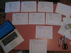
Paper Wireframing
This is where I really think about the functionality. The layout may not be the same as the thumbnails, but I make paper “screenshots” of all the main pages indicating all the functionality I would like to see. This points out design elements I need to think about and helps me envision the feel of the site as the user clicks through it. There are lots of technological tools to accomplish this stage, but it just seems to click better with me on paper.
CSS
When we start talking about design, I start in on the CSS to create the design. I work in a program called CSSEdit*, which allows me to see changes I make to the CSS immediately on screen – i.e. I don’t have to refresh whenever I want to see a change. (There are other ways to accomplish this, but none I have tried are quite as slick as CSSEdit.)
*MacRabbit is no longer making CSSEdit, they folded the functionality into another program called “Espresso.” See my review.
Designing with CSS is a lot of fun, given flexible HTML, a good editor, and a little bit of patience. Building on the work done above, I start taking the best of the thumbnail layouts I’ve created, combining them with color schemes, and incorporating any source images I want to use. Depending on how things will work out, I end up with 1-3 designs to present to the group.
I use plenty of CSS 3 in my mockups. I just tell people they have to use such and such browser to view the site, for now. Once a design is chosen, I will do the cross compatibility check. Some CSS 3 elements will stay as CSS 3, some will be recreated in photoshop. For the most part, I try to progressively enhance web sites – it should look good in all browsers, but it does not have to look the same in all browsers.
At this point all the groundwork I laid with the HTML comes in handy. For instance, I said how I add a class name that describes the part of the site to the html tag like so:
<html class="about">In the navigation, I might have some code that looks like this:
<ul> <li class="home">Home</li> <li class="about">About</li> <li class="content"></li> </ul>in the CSS file, I can can then have some code like this:
.home .home, .about .about, .content .content { background-color: yellow; }(obviously I left a lot out of the code here and wouldn’t use “yellow”, but you get the idea.)
So when you are on the page with the html class=”about” the li with the class=”about” will highlight yellow. This is why I put classes on everything, it makes the process of designing will CSS much more enjoyable if I don’t have to go and adjust my HTML too often.
During the CSS process I may go to photoshop to create a particular graphic, but usually not more than a few per page. This helps keep page sizes down and makes the page a lot easier to maintain. As a general rule, I try to never make text an image. Sometimes it is unavoidable, but it causes maintenance headaches later on. Since we maintain all our old sites, it’s always on my mind as I design.
Though I wrote about Less CSS previously, I don’t use it anymore. It was fun to play with, but I felt like I was trying to rewire my brain using it. It also didn’t quite fit into my workflow. In the end, while many of the ideas were convenient and probably very useful for very large sites, it’s a bit overkill for the size and style of sites I usually make.
That’s it!
Except it’s not, of course. After I show my mockups and one is picked, I will change things until the site launches. And beyond. I can’t emphasize enough that the process is iterative, and all the steps might not occur in the same order. For instance, a scholar might really want to nail down the color scheme early in the process, so I work on that before the rest of the design.
If the site is TEI based, I will go on to write the XSLT (which is where writing my own HTML comes in handy!) to turn it into a website. We currently use cocoon for this, but are investigating other tools. If the site is database based, I will work closely with the developer to create the HTML, usually issuing instructions like: “could you put another class on that element?” My sample HTML is used as a basis for the HTML that will end up in the final site. If we decide on a CMS, I will reconfigure my design to work with the CMS generated HTML.
Tech
You may have noticed I mostly ignored the discussion of what tech to use. This is in part because it could be a whole separate post, but mostly because often this is decided for me.
All the stuff I left out
I’m sure I left a bunch out. If you have questions, ask in the comments or on twitter.
Pingback: A Short Review of Espresso 2, a replacement for CSSEdit 2 | nirak.net
Pingback: Resources from CSS Session | DH Internship
Pingback: Design/UX/Interface/Interaction In the Digital Humanities and Education | THATCamp Iowa City 2012