
Lately the library and academic world (or at least the ones I follow on twitter) are talking about responsive design, a web design technique/philosophy that’s been around for a few years. I think the first article on it was “Responsive Web Design” by Ethan Marcotte in A List Apart, and that’s where the phrase was coined and where I first saw it. When I first read about responsive design, it was such a “duh” moment – why haven’t we always been designing like this? The answer, of course, is that it could not develop until enough browsers supported media queries. Now that most do, and in particular nearly all mobile browsers, we can use responsive designs in all our websites. (For lots and lots of responsive design inspiration, check out the Media Queries design showcase.)
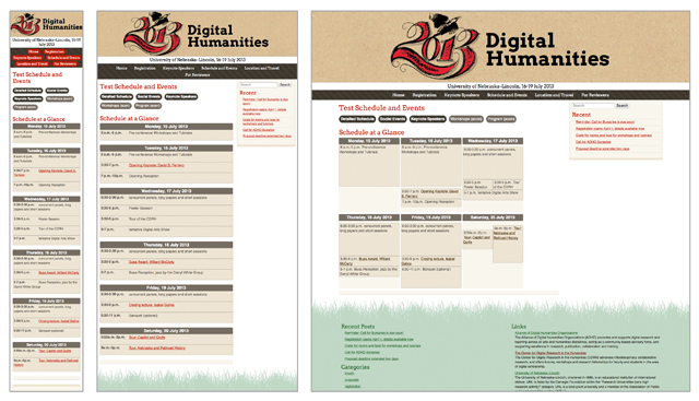 Different views of the Digital Humanities 2013 conference site.
Why?
Responsive Design is based on the idea that content, if well thought out, shouldn’t change, it should just reflow for different screen sizes. It does away with the idea that mobile users are looking for different content than desktop users - everyone gets the same content, just reformatted for their screen size. For the websites I work on, this is a much better solution than a separate mobile site, because it simplifies things and it forces me to think beyond the fixed width layout.
How?
Responsive design works by setting a rule in your CSS. For example, “when the browser is 400 pixels wide or less, make the font size smaller.”
That rule looks like this:
@media only screen and (min-width: 400px) {

   body {

      font-size:.9em;

   }

}
With great power comes great responsibility- please don’t make the font teeny tiny on mobile devices, my eyes will thank you.
Wait, I hear you thinking, 400px on one screen is different from 400px on another! What about retina displays?
There are a couple of ways to handle this:
1: A meta tag in the header that basically says “hey high resolution device, pretend you have normal pixels, OK?”
<meta name="viewport" content="width=device-width, initial-scale=1.0">
By the way, don’t add “user-scalable=no” to that meta viewport tag. It makes puppies cry, and it makes your sites less accessible.
2: Or, you can ignore pixels all together and use em’s instead:
@media only screen and (min-width: 35em) {

      blah blah blah

}
That’s basically it. So if a user makes their bowser window bigger or smaller, the site will change when it reaches the desired size. There are lots of sites out there that will walk you through creating a responsive website step by step. In addition, many CMS’s now come loaded with responsive templates by default (like WordPress’s pretty Twenty Twelve theme).
Mobile first?
There are two ways to use responsive design: design for small screens and then add conditional rules for larger screens, or design for large screens and scale down for smaller ones. Or, you can do both. Which you choose depends one what you’re aiming for, the main screen size of your users, and what percentage of your users use incompatible browsers. Here’s a handy chart of which browsers support media queries (spoiler alert- basically everything except IE 8 and below).
Sometimes I’ll serve up the mobile version of something to IE8 and below, because it’s easier than dealing with the other rendering bugs that come with the more complex version for larger screens. All the information is there, it’s just not quite as pretty.
Awesome! How do I start?
Besides reading a tutorial or two, I’d start with a HTML5 boilerplate template which includes a sample media query, and start writing HTML and CSS. Or, take an existing responsive theme and make some changes. Or, download a responsive HTML/CSS framework and make something. There’s also a bunch of books on the topic, including a $9 ebook called Responsive Web Design, written by Ethan Marcotte, whose article I mentioned at the beginning of this post.
That’s it! I think responsive design is a lot of fun, and a breath of fresh air after years of having people ask me “what about the mobile version?” Now, my sites only have one version, and work on almost all screens.