This is part of a series on accessibility and usability. See the contents page for more.
Design and navigation are important aspects of your site’s accessibility. Clear, concise navigation helps users that must use their keyboard to get around, and a clear, clean design helps users find your content with a minimum of fuss. A good design should also allow the user to change it – for instance, make the font bigger or smaller, or change the colors so they can see it easier.
Navigation
Use words your users will understand. Exactly what words your users will understand is still somewhat of a contested issue, but there are several articles to help. John Kupersmith has put together an excellent site citing 51 usability studies called Library Terms That Users Understand. Among his findings are that users do not understand things like library acronyms, brand names and jargon, and that many terms that are straightforward to a librarian, such as “databases” and “library catalog” may not mean the same to users. In general, try to use natural language phrases such as “find books,” “find articles” and “ask a librarian.”
Label outside links clearly, and never link to an outside site (i.e. one that has a different look or feel or different navigation) from what looks like a navigation area. This area is generally the top bar of the site, and sometimes a side bar as well.
Plan out your navigation carefully, and try not to have too many sections and subsections. There is no perfect number of navigation items, but the more there are, the more likely your user will end up lost and confused. Users won’t want to look over a list of 10 items to find what they are looking for. Plan out the top level and sub navigation so that users are presented with a few choices each time. Try to consolidate pages wherever possible. Write and rewrite your copy so it is clear and concise, and gives users an immediate idea of what to expect on each page.
Build a robust search, as many people will give up on navigation quickly and will jump straight to search to find what they need. If you use a search like Google’s custom site search, the hard work you did in coding will work for you – your titles and headers will lead the user to what they are looking for.
Let the user know where they are by indicating it graphically. You can show a user where they have been by incorporating breadcrumbs into your site, but at the very least the user should know where they are at a glance. This might be accomplished by changing the color of the navigation for the page the user is on, and including a title that lets the user know exactly what they can find on that page. See Derek Powazek’s article “Where am I?” for more.

Carnegie Library of Pittsburgh hightlights the navigation showing the section you are in, and has a "you are here" bar so users can orient themselves.
http://www.carnegielibrary.org/research/art/
Also note that the URL gives users and indications where they are- the main body of the URL is followed by “research” and “art,” which correspond to the section and subsection the user is in.
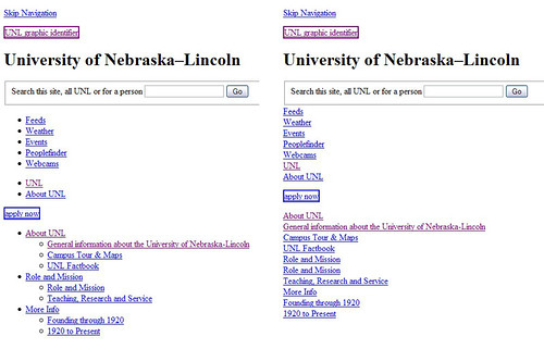
Use a list to mark up your navigation. After you have marked up your navigation, you can use CSS to make it look like whatever you want. Consider the following example:
The navigation on the right is hard to understand- but the list on the left gives it structure that will come in handy when a screen reader is trying to navigate your site.
Offer users the option to skip the navigation if at the top, or skip to the navigation if it is at the bottom. In the figure above, there is a “skip navigation” link that allows users with a screen reader to skip the navigation so they don’t have to listen to it over and over.
Design
Designing a website is hard. Trying to keep accessibility and usability in mind while designing a website is even harder. And trying to work with a designer- well, that can sometimes be really hard (I know, I’m a designer). But whether you are designing on your own or working with a designer, following a few ground rules can help immensely.
Set some rules. Before letting a designer loose on your concepts, set some expectations. For instance, if you want to avoid using text in images (as mentioned in the last part of this series), mention that up front. Likewise, if you want to avoid using images for navigation, mention that too. It is much easier to design with accessibility ans usability in mind than to retrofit a design after the fact.
Take advantage of open source design. If you are designing a site yourself, you don’t have to start from scratch. Whether you are using a content management system, or coding from scratch, you can take advantage of open source design to get started. Find a template, theme, or design that is close to what you want and then tweak it ’till you are happy. Just be sure to credit the maker as appropriate if you do go this route! Each design will include specifications on how to credit the maker. Google for open source design to find designs, or look at the templates available for the CMS you have chosen.
Try to avoid making content look like ads. People have been trained over years to avoid clicking on anything that looks like a banner or sidebar ad or text ad. As you look around the internet, think about where ads are placed, and about their side and shape. Then, avoid using these same conventions for your content. (See item number 10 on this article on usability findings for this and more usability tips.)
Simplify, simplify, and simplify again. This applies to the code, the design, the writing and the pages. Really look at each part of your site and think about whether it is needed, or whether it could be combined with another part. Try to eliminate parts of your pages and add whitespace between items. Simplify your writing to use shorter sentences and fewer words. (Think “being concise” rather than “dumbing down.”)
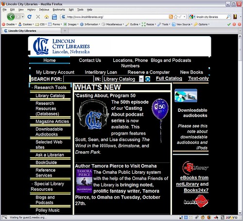
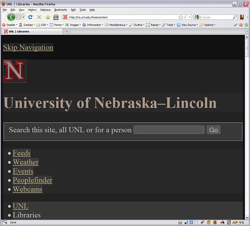
Realize your user will mess with your design. The beauty of the web is that it is malleable, and if you separate your design from your content, the user will be able to change the content so they can read it easier. This is great! This might be something as simple as making the font bigger on the page, or as dramatic as turning off all styles and viewing the page with white text on a black background.


Pingback: Nirak.net » Accessibility and Usability
Hi Karin, your presentation and these blogs are wonderfully thorough.
As you point out, “trying to keep accessibility and usability in mind while designing a website is even harder.”
Luckily, it’s getting a bit easier, at least in terms of usability testing. Website Magazine did a nice review of some of the new online, low cost usability services that exist today (I work with UserTesting.com, but this article reviews a few of the good products on the market today): http://bit.ly/2RATxW.
Good luck on your presentation on Thursday!
Pingback: Nirak.net » Accessibility and Usability – Part 3: Tools