Nebraska Library Leadership Institute

Last week I attended the Nebraska Library Leadership Institute (NLLI), which is held every other year at the Saint Benedict Center in Schuyler, NE. I got a lot out of the week, and I am thankful that my library provides me with opportunities like this.

The week consisted of a lot of group activities, many which were similar to group work in college, but the focus wasn’t on the work itself but how individuals in the group led and how they could be more effective. While I found the material interesting, I wasn’t sure how I would relate it to my job, and it brought up my recurring feeling that I wasn’t doing enough or that I should be looking for a job with more leadership potential. I talked with a lot of people about what they did and did a lot of thinking about what I want to do. Incidentally, I was told by a few people I had the “coolest job there,” and while I don’t think that’s true it was nice to hear.

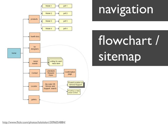
My wavering went on all week until the final day when we were asked to make a personal action plan, with actions for myself, my organization, my community, and the profession. This was when the lessons of the week came into focus for me. I decided that, for now, I want to focus my energies on a different kind of leadership. Namely, I want to lead by developing my tech and design skills to the point where I (hopefully) lose some of the imposter syndrome I constantly carry with me by being able to speak with authority on matters of technology and DH website creation. At that point I will reassess whether I want a more formal leadership position.

To that end, I made the following goals, which I am putting here in the hope that doing so will make me follow through. The timeline for all this is a year, at which point I will reassess.

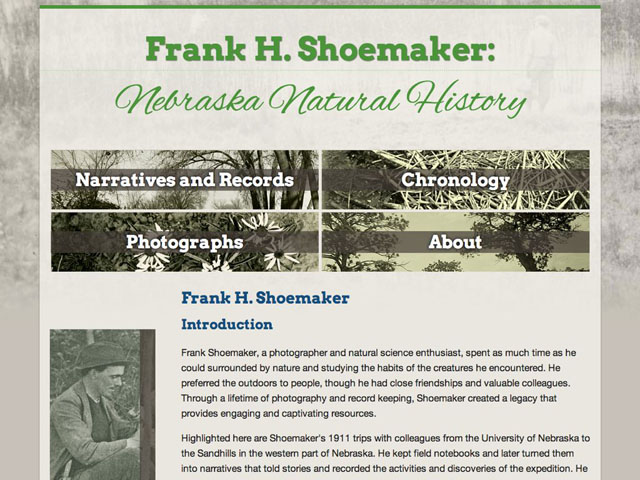
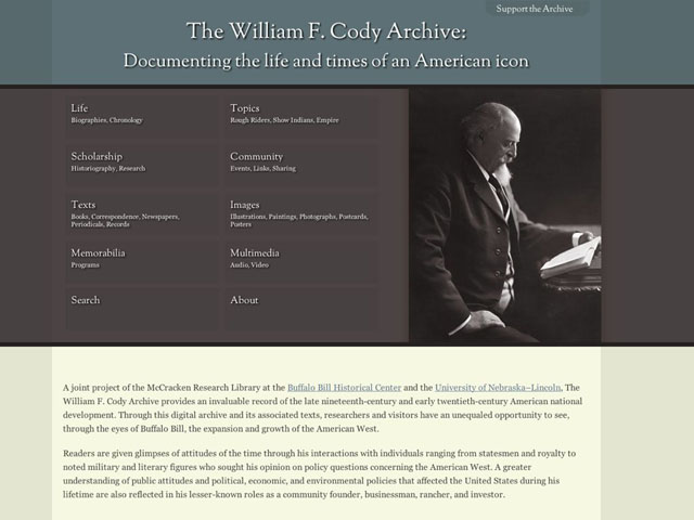
For myself: I will increase my technological knowledge, in particular knowledge about which technology to use for which purpose. Actions that will move me towards this goal: 1: Redo one of our sites in another technology (aka, learn another programming language). 2: Meet with others to talk about code 3: Start keeping code on github. In addition, I will start blogging here more often. This has always been a problem for me—I hate blogging about tech because I feel like everything I’d have to say is so beginner level and obvious.

One of my colleagues has proposed starting a “Women who Code” group in Lincoln, so I think that will go a long way towards goal 2.

I need to do a bit more thinking about what goals for “my organization, profession, and community” will be. Is my organization my library, or the center I work in? What kinds of professional activities should I be involved in? Which professional organizations should I immerse myself in? I currently have a list of 6 I have been in or am interested in, but I think I need to focus on one or two if I am to accomplish anything. What professional development opportunities should I pursue?

Over the next few months I will develop a learning/action plan for myself more fully, but for now it’s nice to have something of a plan. I’ve been feeling a bit lost professionally lately, and the NLLI gave me the kick I need to get on track.

Posted in Digital Humanities, Library | Comments Off

Reflections on #DH2013

Yesterday I performed my last duty for the Digital Humanities 2013 conference, which didn’t feel like a duty at all: I co-led the local tour of the Nebraska State Capitol and the Quilt museum for a small group of two. After that, I read a book I have been meaning to for a while (Neil Gaiman’s Ocean at the End of the Lane), played with my dog, took a nap, and cleaned up around the house. I feel like my life has been on hold for a while, at the same time, I hardly know what to do with myself when I don’t have to check email every half hour.

This was my second DH conference (my last was in 2009 when I was able to attend as a student) and I got more out of it this year. For one thing, I am actually in a job where I make things this time, so I had a lot more to talk to others about. Second, I have been in touch with many in the community from attending THATCamps and other events, which made it easier to connect. There were a lot of panels I enjoyed, and I got to talk to a lot of very interesting people doing very interesting things. What follows is a jumbled list of my impressions after not enough sleep.

1: Women as role models. One of my few disappointments of DH this year was that I only caught the Q&A portion of thePanel “Excavating Feminisms: Digital Humanities and Feminist Scholarship”. Still, even that was great to see: many people talking about the role of feminism in DH and pedagogy, and how that’s good for men and women. I also quite enjoyed “Against the Binary of Gender: A Case for Considering the Many Dimensions of Gender in DH Teaching and Research“. There are so many inspiring women in the DH community, so many role models, starting with the co-head of the CDRH, Katherine Walter, who almost single handedly organized DH 2013. The head of the program committee, Bethany Nowviskie, is also tireless and tenacious. While at one of the receptions I was talking with two other women, Erin and Molly, and Erin remarked that it was nice to talk to other women about code. Indeed it is, and I had not realized how rare it is to talk to other women about code or technology in general. This conference has inspired me to seek out other technical women and keep in touch.

Beyond coding, though, the women I met at DH were inspiring for their presence, and their commitment to their ideals. I was amazed by the women I saw who were pregnant (it is hard for me to fathom attending a conference like this while growing a human being). There were also women who brought their kids with them. It is inspiring to see women who can seemingly do it all, though I recognize what they make look easy didn’t come easy. To top it off, the terrific closing keynote by Isabel Galina was about inclusiveness — not only of gender, but of all people. The message seemed well received, and though DH is disproportionately white and male, it’s also filled with white males that recognize the advantage of hearing voices unlike their own.

2: DH as community. The longer I am in DH, the harder it is to see myself doing anything else. Besides the fact that what I do now is more interesting than anything else I have ever done, I feel genuinely useful in DH, rather than an interchangeable part contributing slightly to a bottom line somewhere. I sort of stumbled into this, and I am forever grateful for it. Almost every single DH person I meet is fascinating, smart, yet approachable — a tough combo to find. This year, the ADHO sponsored a set of newbie dinners that were amazingly well attended and very fun — one example of how DH reaches out to newcomers.

3: Growing my technical skills. My technical skills have improved so much since the last DH I attended, and it was very gratifying to have very technical conversations I could not only follow but contribute to. I found the work others were doing inspiring, and it has encouraged me to broaden my toolset and, especially, programming languages. It was gratifying to see so many people using SOLR, since I am so enamored of it, and I am excited to try using it in contexts other than the cocoon/XSLT framework I usually use it in.

4: Growing, and solidifying, my design skills. I talked to a few people about designing DH projects, and I always felt sort of rambling and incoherent when talking about design. I have a definite aesthetic I have developed over the last 4 years working on projects, but I haven’t tried hard enough to explain it beyond the actual process of designing sites. I’m also more committed than ever to responsive design and accessible sites (thanks largely to George Williams), and making that commitment clear on the projects I work on.

5: Libraries and DH. Sarah Potvin and Roxanne Shirazi organized a well attended and terrific GLAM meetup (that’s “Galleries, Libraries, Archives, and Museums”) at Yia Yia’s, which was great fun. In addition there is a proposed Library SIG through ADHO. It was great to talk to librarians about what they are doing — visualizations, text analysis, helping students with DH projects, and, of course, the “boring” digitization and digital preservation work that forms the backbone of many, many DH projects.

6: Lincoln. It’s not often we get to host international conferences in our home town, and it was deeply satisfying in a way I still can’t quite articulate. I think it comes from the fact that, as part of “flyover country,” Lincoln is a place that most people wouldn’t see without an event like this to bring them here. Having people from all over the world where I live had the same effect as traveling for me: it rekindled the love I have for Lincoln, warts and all. I find it hard to articulate what I like about Lincoln much of the time, but I believe it is rooted in the peace I find here.

Plus, it’s really great to have my bike at conference and to be able to go home to cuddle with my pets.

I will have more thoughts a bit later on some of the lessons learned building the conference website, attempting to run a social media presence, working on the book of abstracts, and swag (tshirts are hard).

Posted in Conferences, Digital Humanities | 2 Comments

Responsive Design: a Primer

Lately the library and academic world (or at least the ones I follow on twitter) are talking about responsive design, a web design technique/philosophy that’s been around for a few years. I think the first article on it was “Responsive Web Design” by Ethan Marcotte in A List Apart, and that’s where the phrase was coined and where I first saw it. When I first read about responsive design, it was such a “duh” moment – why haven’t we always been designing like this? The answer, of course, is that it could not develop until enough browsers supported media queries. Now that most do, and in particular nearly all mobile browsers, we can use responsive designs in all our websites. (For lots and lots of responsive design inspiration, check out the Media Queries design showcase.)

dh2013_smDifferent views of the Digital Humanities 2013 conference site.

Why?

Responsive Design is based on the idea that content, if well thought out, shouldn’t change, it should just reflow for different screen sizes. It does away with the idea that mobile users are looking for different content than desktop users - everyone gets the same content, just reformatted for their screen size. For the websites I work on, this is a much better solution than a separate mobile site, because it simplifies things and it forces me to think beyond the fixed width layout.

How?

Responsive design works by setting a rule in your CSS. For example, “when the browser is 400 pixels wide or less, make the font size smaller.”

That rule looks like this:
@media only screen and (min-width: 400px) {
body {
font-size:.9em;
}
}

With great power comes great responsibility- please don’t make the font teeny tiny on mobile devices, my eyes will thank you.

Wait, I hear you thinking, 400px on one screen is different from 400px on another! What about retina displays?

There are a couple of ways to handle this:

1: A meta tag in the header that basically says “hey high resolution device, pretend you have normal pixels, OK?”
<meta name="viewport" content="width=device-width, initial-scale=1.0">
By the way, don’t add “user-scalable=no” to that meta viewport tag. It makes puppies cry, and it makes your sites less accessible.

2: Or, you can ignore pixels all together and use em’s instead:
@media only screen and (min-width: 35em) {
blah blah blah
}

That’s basically it. So if a user makes their bowser window bigger or smaller, the site will change when it reaches the desired size. There are lots of sites out there that will walk you through creating a responsive website step by step. In addition, many CMS’s now come loaded with responsive templates by default (like WordPress’s pretty Twenty Twelve theme).

Mobile first?

There are two ways to use responsive design: design for small screens and then add conditional rules for larger screens, or design for large screens and scale down for smaller ones. Or, you can do both. Which you choose depends one what you’re aiming for,  the main screen size of your users, and what percentage of your users use incompatible browsers. Here’s a handy chart of which browsers support media queries (spoiler alert- basically everything except IE 8 and below).

Sometimes I’ll serve up the mobile version of something to IE8 and below, because it’s easier than dealing with the other rendering bugs that come with the more complex version for larger screens. All the information is there, it’s just not quite as pretty.

Awesome! How do I start?

Besides reading a tutorial or two, I’d start with a HTML5 boilerplate template  which includes a sample media query, and start writing HTML and CSS. Or, take an existing responsive theme and make some changes. Or, download a responsive HTML/CSS framework and make something. There’s also a bunch of books on the topic, including a $9 ebook called Responsive Web Design, written by Ethan Marcotte, whose article I mentioned at the beginning of this post.

That’s it! I think responsive design is a lot of fun, and a breath of fresh air after years of having people ask me “what about the mobile version?” Now, my sites only have one version, and work on almost all screens.

Posted in CSS, Web Design and Development | Comments Off

HTML, CSS and Design lightning talk

About a year and a half ago, I posted on my design process. Not a lot has changed since then, but I’ve been asked to help facilitate a class session on HTML, CSS and Design. As always, it’s helpful for me to write about it first, and I figured I might as well put my observations here as well. Most of this will be a direct translation of the slide show I plan to give. It’s supposed to be a super fast overview to generate questions.

One of the biggest changes in the way I work over the last year and a half is I’ve pushed design farther and farther back in the process; after I build the site, usually. This really lets me focus on content and how it will be presented before getting into the often messy design details.

Determine Content

If you are working on your own project, content is easy. If you are designing for someone else, you need to get them to give you the content, or at least tell you about it. Either way, you need to get a firm grip on not only what the content is, but how you will organise it.

s2.b

Collect and Create Design Ideas

  • Pore over project materials
  • Browse other websites
  • Research other photos, artwork, etc
  • Find color palettes
  • Collect fonts
  • Create sketches – of layouts, colors, design elements, anything.
  • Save everything
  • Create collages (optional). These can help guide the design process later, and serve as something to talk about with the group in the meantime.

s4.b

s5.b

s6.b

Pick a place to build site

Start to Build Site

  • Plain HTML or
  • PHP or
  • XML/XSLT/Cocoon or
  • CMS (WordPress, Drupal) or
  • One of hundreds of other possibilities or a PHP/Ruby/other language framework
  • Dependent on where you will be hosting
  • Google for books/tutorials on chosen technologies

s9.b

s10.b

s11.b

s12.b

Work on Architecture

  • Use flowcharts to determine content flow
  • Draw up wireframes (on paper or computer)
  • Determine navigation, including wording. Avoid jargon.
  • Think about both casual and specialist audiences
  • Aim for clarity

s14.b

s15.b

Design

  • Read a lot about design, if it interests you, take a design or art history class or two.
  • Find some designs you like (perhaps open source) and figure out why you like them.
  • When in doubt, keep it simple.
  • When possible, start with bare bones version of site, and build up from there.

s1

Basic Design Principles: Simplicity

  • In the beginning, may be best to use KISS design principles.
  • Try an image search for “minimalist web design.”
  • Simpler is often better than cluttered, let your content shine.
  • Start with inside pages, then move to “splash page” if there is time.

s18.b

s19.b
With content as complex as this, who needs a cluttered design?

s20.b
A splash page does not have to be complicated to be beautiful.

Basic Principles: Alignment

  • Line things up.  This is pretty easy vertically when designing webpages.
  • Pay attention to margins, padding, and borders.
  • Read about how the CSS box model works to help with alignment.
  • Look into grid based CSS frameworks (Like the 960 framework or twitter bootstrap) and try them out. Even if you don’t use them it is a good foundation.

s22.b

s23.b
The header is center aligned, while in the body boxes and text are aligned to the same margin.

s24.b

Basic Principles: Color & Contrast

  • Find inspiration in project materials if possible, and look at other sources.
  • Look at color websites and save palettes that make you think of your project.
  • Pay attention to context – colors will look different depending on where they are.
  • Keep in mind colorblindness and contrast sensitivities.
  • When in doubt, it’s hard to go wrong with black text and a white background and a splash of one or two other colors.

s26.b
It can be fun to create palettes from images you are inspired by.

s27.b
The same gray looks different on a red or blue background.

s28.b
Red/Green colorblind users won’t be able to distinguish between the two colors on the left.

Basic Principles: Typography

  • Choose 2-3 fonts, and use decorative fonts sparingly.
  • Use open source fonts that are free to embed. (check out Google Web Fonts and Font Squirrel)
  • Choose body fonts for readability, test them at varying sizes and on different computers.
  • Check to make sure the fonts support the character sets you need them to – ligatures, foreign languages, etc.
  • Don’t put text in images.

s30.b

s31.b

s32.b

Questions?

I might update this post later if I get questions I forgot to address. If you have any questions, feel free to leave a comment.

Posted in Uncategorized, Web Design and Development | Comments Off

Photography Color Experimenting

Pages

I’ve been conducting some custom white balance color tests with my camera. I have been making it up as I go, and now want to reshoot al the tests with new color cards, but I thought I would go ahead and link up what I have done so far in case anyone is interested.

Here’s what I have done so far:

First, I painted up some random color cards for custom white balance tests. I didn’t really have a set idea of what colors I would paint here, except that I would do some warm (redish or yellowish) and some cool (blueish). I also used a few color cards I had inherited. My first test shots came out interesting (to me at least):

Custom White balance tests

After I shot all the pictures, I used opened the raw images in lightroom and looked at the temp for each of them. As I noted in a previous post, I was surprised when I learned that two of them had the same temp (k value) but were different colors. this is because the camera also sets the tint of the photo.

Custom White balance tests

So, I decided to repeat my experiment, but with some different color cards. At this point, I made a mistake – I painted up some color cards that were based on what I’d learned to be the color wheel: Red, Orange, Yellow, Green, Blue, Purple. I didn’t even do that good a job painting them – I’d have failed this assignment if it was art school. Besides each of the 6 colors, I painted a light version and a dark version of each.

Photo Oct 08, 9 36 48 AM

I then shot a still life using the cards to set a custom white balance, under 4 different types of light:

  • Cloudy Daylight: This was next to a large open window with cloudy, 3pm daylight outside.
  • Alzo Daylight Bulbs: Main lighting was two 100 watt equiv bulbs (4 in room total).
  • Cheap daylight lamp: I didn’t set this op up correctly, so I consider it a failure. oops.
  • Incandescent: A single 60w incandescent bulb in a desk lamp.

After I shot each of these, I used lightroom to find the temp and k values of each of the photos. I also white balanced the color cards according to a white card. (I sure hope this is making sense to someone else.)

I also shot a set of photos color shifted using my camera’s white balance bracket / color shift feature, and took a photo of the screen of each of the settings. The camera was set to daylight for each of the shots, and I used the K and tint values to fake a shot for each of them by applying the camera’s readouts to a color balanced still life shot.

SO, after all that, I put together some test pages for each of the types of light where I can sort by temp or k values:

I plan to reshoot the photos based on color cards pulled from the color shift shots, but am not sure when that will be since my free trial of lightroom ran out and I’m not going to buy it right away. (If anyone knows of a free program which will tell me the temp/tint values, let me know – The Canon camera raw software won’t, and my copy of photoshop is too old to open my camera’s raw files.)

What have I learned? Nothing definitive, but a few things I find interesting.

  • The color shift pictures from the camera follow a pattern when sorted by temp and tint (this may make more sense if you look at the Camera Color shift experiment):

temp_tint_paths

  • I really need to rethink color if I am going to work digitally. It’s hard to unlearn/relearn everything you know about something, but I need to find a way.
  • Temp seems to be a bit more consistently applied by the camera than tint, which can vary wildly.
  • Using color cards seems like a quicker method of getting a desired color shift than setting a color shift in the camera, provided you already have some cards made up.
  • I’m probably doing these experiments as a way to procrastinate applying principles, i.e. actually getting out there and taking photos.
  • I am not really sure what to make of this all, but I am fascinated with the results.

My next step is to build a spectrograph and go back and create a graph for each of the light sources I tried (I won’t be able to get exact on the sunlight, but I hope to get close.) I am hoping this graph in addition to the photos will give me a better picture of the effect of different lights on photos. But, I fear I need to reshoot the photos with a better set of color cards first.

Posted in Uncategorized | Comments Off

Note on content/housekeeping

Why the weird posts?

After a long time of not using this blog very regularly, I want to start using it again. If you have been a long time follower of my blog, my recent posts on photography may seem a little out of place compared to some of my older content. I have a couple of other blogs — space.nirak.net and art.nirak.net and I sometimes have trouble deciding what to put where.

I decided on the following basic breakdown:

nirak.net: computer/research. This is why the photography experiments have ended up here, they are sorta researchy. Anything work/digital humanities/library related will stay here, but I’m hoping to have a place at work to write about those things at some point.

art.nirak.net: Individual artworks, shown in a large format. I have not featured photographs here very often, but I plan to start if any of my shots get good enough.

space.nirak.net: Everything else, including gardening, cooking, photo dumps, and art process things (although that could be considered research, categories are hard). I may eventually collapse this blog into nirak.net, but I want to keep it as a separate experimental space for now. I’m guessing this blog will be of interest to those who know me personally, if anyone.

Feeds

I have switched all my feeds to the native feed rather than the feedburner feed. If you subscribe to the feedburner feed, you will probably keep getting posts for a while, but if you want to make sure you are getting the correct feed, it’s probably best to resubscribe. (I’m not all that sure about feedburner’s longevity.) If you are using feedburner for an email subscription, let me know and I will figure something else out.

Here they are so you don’t have to go hunting:

I’m told all the time that no one uses feeds anymore, but I use them every day.

Design shake up

Finally, I am going to be changing up the design around here. Hopefully I won’t break things too bad.

Posted in My Stuff | Comments Off

Librarians and programming revisited

Recently, Peter Murray wrote on The Security Implications of Teaching Librarians to Program, and I agree with both the potential problems and his solutions. I’d add that I would never want to do any programming on a server that contained student data (we are lucky to have several of our own spaces) for obvious reasons. I wouldn’t recommend it for even experienced programmers if they can help it, especially when working in the digital humanities where we are always trying new things. Luckily, server space is cheap, and I think it would be well worth $100 a year to get some commercial web space for a librarian who wanted to try building something. Alternately, the library could try and get an old server to use as a testing space for budding coders. The same could be said for DH students who want to try their hand at building a project of their own.

Peter’s post got me reading my old post on  Why every Library Science student should learn programming from 2008, which is still one of my most popular. I thought it might be a nice time to reflect on whether I still think it’s true (spoiler alert: I do.)

Many of my original reasons hold true (especially being able to migrate data formats oneself) but some of them are a little… optimistic, shall we say. I don’t think that librarians should be handling the ILS backend necessarily, and I think libraries should be hiring trained programmers for much of this stuff when they can — not that there will never be any overlap. I still think programming should be written into the library school curriculum, though.

In the last 4 years, I have served on a lot of project teams with a lot of different types of people with a lot of different digital projects. Some of my favorite people to work with are the semi programmers, the ones that know enough to have done some initial exploring, but also know that to build something ready for prime time, it’s best to call in help. These people know how hard programming is, and so they tend not to be the ones who expect a turnaround time of a few hours for complicated requests. They also tend to be the ones who are best at explaining what it is they want: not only the ideal version, but the good enough version (we usually end up somewhere in the middle.)

This is one of the reasons I think librarians should take a programming class: there’s nothing like beating your head against that wall to make you realize how complex this stuff is. Add to that that it increases the chance the librarian will be able to explain things when he or she needs help: what exactly went wrong, what they think might be the problem.

The other reason I still agree with past me has little to do with whether the librarian will actually use programming in their job. I have been approached by several people over the last few years who ask me, hopefully, about library school. One of the common threads I see is some of them want a place where they can stay away from technology. Some (still!) see libraries as a last refuge for luddites. It’s not that luddites can’t have a place in libraries, but I think those places are few and getting rarer. Requiring a programming class is like requiring cataloging even of those who are positive they’ll never be catalogers: it’s a minimum standard to reach, a proof that you’re willing to at least try other ways of thinking about data and information.

To be honest, I’d like to see library school in general get harder. I would have liked it to be harder. I have a friend in library school now who is shocked and dismayed at how easy it is. For the brightest, at least in some programs, there’s very little challenge and few opportunities for growth. Programming is challenging. It forces one to see computers, and information, in a new way. Whether or not one ends up using this for a career, it shifts how one thinks about things. That, to me, is the benefit.

Posted in coding, computers, Library | 2 Comments

To shoot raw or not to shoot raw

I’ve been going back and forth on the “shooting in raw” question for a while. Raw is the native format of whatever camera you are using – and it is different for every camera. It is uncompressed, like PNG’s and TIFF’s, unlike the compressed JPEG format. And, since it saves much more information from your camera, it allows for some nice adjustments after the fact.

For instance, the color experiments from the last post were all shot in raw, and it would have been impossible to see the information on color temperature and tint without the right format. Also, it was much quicker to shoot because I didn’t have to re-set the white balance to the color of the light source before I shot every color card.

These are the images straight out of the camera. The color cards aren’t correct because they have the white balance of the card that came before.
White balance pics
These are the images once I adjusted the color cards to match the color of the light source. The colors now seem to be properly “opposite” one another.
Custom White balance tests


Besides white balance, raw format allows you to make other changes after the fact: sharpening, saturation, and contrast. It’s fun messing with these changes to give photos a whole new look.

White balance pics

(The picture on the left is shot with the same white balance as the garden picture in my last post, on the right, I let Adobe Lightroom select a white balance, which looks pretty correct.)

I work in a digital humanities center in a library, so I know all about lossless image formats and why archives use them. I also really like the control raw gives me. But, for the most part, I won’t be shooting in raw for the foreseeable future, for the following reasons:

1: It’s slow. Using raw adds a lot of time to the process. Downloading, processing, everything takes a little longer. That might be because my two year old computer is somewhat old in computer years, but I’m not ready to buy something newer and faster yet.

2: I don’t actually want to spend a lot of time fiddling with my images on the computer. I spend all day at work on the computer, so I’m always looking for ways to minimise my screen time at home. What started this whole process was that I wanted to figure out to make images closer to perfect in the camera, so shooting raw so I have a safety net kind of takes away from that.

3: They take up a lot of room. A jpeg right out of the camera is 5 mp compared to 25 megs for raw. I know space is cheap, but I already have 115 GB of images and have a hard time getting everything stored and backed up. If space is an issue and you like shooting in raw and fiddling with images, you can always save to jpeg and only save the raw images that are really spectacular.

4: The software costs more. At least with canon, I don’t really like the software that comes with the camera, and lightroom, aperture, etc cost a lot. (I’m using a 30 day free trial of aperture right now.) I also find the software clunky after years of using picasa but again, slow computer. My older version of photoshop won’t even open my camera’s native raw photos (yes, even with the latest plugin.) This kind of incompatibility makes me wonder if I’d be able to open these photos in the future, as well.

5: Honestly, I just can’t tell the difference. I compare this to the fact that I can’t tell the difference between FLAC and MP3′s. I’m just not very discerning, I guess. I’ve printed jpegs out at 13×19, I’ve imported jpegs into photoshop’s raw editing program, I’ve made repeated changes, and only when zooming waaaay in on my screen do I see a difference. With 18mp pictures, you would have to print or view a picture very large to see the degradation, and given that I’m a) not a professional and b) still learning, I don’t think I will have any shots that really necessitate that.

I still might shoot in raw when I’m experimenting, need a really wide dynamic range, or shooting something really important, but chances are for now I’ll just save them right out to jpeg once I’m done processing and delete the raw images.

Posted in Uncategorized | Comments Off

Digital photography and white balance

It all started with simply wanting to take better photos. I bought a Canon t3i this year, and have been using it fairly frequently, but still felt I was fumbling with the controls more often than not. I’m not a photography newbie; I have been taking pictures with a film SLR camera since high school, and have taken half a dozen photography courses all told. But all the courses I took were in film photography, and there was something fundamental I wasn’t getting in digital.

I was also driven by the desire to spend less time on the computer fixing things I should have gotten right when taking the picture. I may have been a little naive.

This will hopefully be a series of blog posts about what I have learned about digital photo making.

So, first up: White balance!

In film photography, white balance as such wasn’t such a big deal. You picked a film for a type of light, and then you might use a slightly warm or cool filter if the light you were shooting under didn’t match the type of film. In general, the mismatch is one of the things that gives film it’s “look.” The instagram app has a bunch of filters you can apply that are meant to mimic different camera and film pairings, and usually one of the most noticeable changes is the photo will get warmer or cooler.

I knew the basics of white balance when I started: where “daylight” was on the continuum, what was considered warm, what was considered cool. I knew the basics of color theory from art school. My first idea was I would start using the auto white balance feature of my camera for aesthetically pleasing effects. But how did it work? What was changing when I set the white balance?

My first little experiment was to take a few pictures of my garden with the reddish cedar mulch as the “white balance.”

White balance tests

I liked the result, so I took some more test pictures. I then hit upon the idea to make some ready made cards so I could set a custom white balance of my choice – making images look warm or cool even when the light wasn’t obliging. (This concept isn’t new, as I found out when I searched and hit upon warm cards, meant for digital filmmaking.)

So, I (badly) painted up some cards with different colors, and used them to set the white balance on a still life. At this point, I was wishing I had one of those fancy cameras that let me set the white balance by Kelvin number. (I found out later I can download a firmware called Magic Lantern to do this, but I have not been brave enough to try it on my camera yet.)

Custom White balance tests

Then, I arranged all the resulting pictures by kelvin number, thinking I would get a nice gradient:

Custom White balance tests

I was surprised when some of the pictures with the same kelvin numbers were completely different:

Custom White balance tests

This is because the camera sets the tint as well as the temp, and there doesn’t seem to be any way to change this. A little research led me to this page where I learned that the temperature is a blue/yellow setting and the tint is a green/magenta setting. I can alter the tint in camera by using the white balance shift setting, but that just shifts it from where the camera decides it should be. So, my dreams of getting reproducible results based on setting the kelvin number were somewhat dashed.

At this point, I also started to wonder about the different types of light on my pictures. The above pictures were taken with some cheap “daylight” bulbs, but the effect wasn’t really all that close to any daylight I’d ever experienced. That research is for another post, though, as I’m waiting for some supplies to come in for my experiments.

Posted in Uncategorized | Comments Off

SXSW notes, Tech sessions

Sorry about the long break in my SXSW notes recap. Time sort of got away from me there.

I didn’t go to as many tech meetings this year as last, which was good and bad. I’m glad I got to go to a variety of sessions, but the few tech sessions I attended left me wanting more. This may point out that I need to go to a more tech heavy conference sometime in the future.

The State of Browser Developer Tools

Brandon Satrom, Garann Means, Joe Stagner, Mike Taylor, Paul Irish

The gist of this session was: browser developer tools have come a long way in a short while, and it is worth checking out what each browser has to offer.

Chrome: Offers a new color picker, and some subtle but nice UI changes that makes the dev tools much more useful. You can also save the CSS out to a new file. Both Firefox and chrome have very nice CSS tools in this regard, and if they come just a bit further (some auto completion, better color coding) they could make it so I don’t need to find a replacement for my long in the tooth and no longer made CSS Edit 2.

Chrome for android: Plug in via USB, run the dev tools from the device.

Firefox: When viewing a page, go to Tools -> Web Developer (different from the web developer toolbar) -> Inspect and then click on “3D” in the bottom right. It’s called “Tilt” and it made the room collectively gasp.

Screen shot 2012-04-20 at 4.08.59 PM

Opera: Offers remote device debugging and great emulators.

IE 9 & 10: let you emulate older versions of IE. (I have found this to be a tad off- I’ll use the IE7 emulator and then view the page in IE7 and they’ll be different- but it is pretty close.)

What’s coming:

Adobe Shadow: Multi device checking (Here now, will get better)

Usability for styles. HTML tidy-like features.

CSS for Grown Ups: Maturing Best Practices

Andy Hume

Web standards can become an obsession. We get ridiculous code to keep content and session separate, but managing complexity is important too. Complexity raises the barrier to entry.

We need to optimize for change. Most of all, we need to let go of the idea that we will write HTML which we will never touch again, and do everything on the CSS side. We will ALWAYS have to revamp the HTML along with the CSS.

Bullet points:

  • Check out stuff like: OOCSS, SMACSS, CSS Lint – advocating a new set of best practices.
  • Should have layers of CSS: Layout styles – Module styles – base styles on top of the HTML
  • Come up with classes that describe the presentation. headline, subheadline, byline, etc.
  • The important thing is to do what is best for your local situation, and not to hold to outdated dogma for the sake of dogma. You have to strike a balance between performance, maintainability, and readability.
  • Use presentational class names and surgical layout helpers.
  • Document your code in code, NOT a PDF! Twitter bootstrap is a good example of this.
  • Write a complete style guide. Use it consistently for your organization. Include interaction.
  • Think in terms of modules, not pages. Have a style module library.

Creating Responsive HTML5 Touch Interfaces

Stephen Woods

Switching to thinking about devices rather than interfaces is hard. Interfaces should feel good in addition to looking good.

Some advice:

  • Prioritize user feedback.
  • Use hardware acceleration
  • manage memory – devices are always low on memory
  • Do not load during gestures – hold it till the end
  • Treat the DOM as write only, do your own math. “If you just do the math, you’ll be happier in the long run.”
  • Use matrix transforms.
  • Use CSS transitions. Use transitions with easing to snap back, good enough in most cases.
  • Feature detect and add as devices support. Disable things per user agent.
  • Simulators and emulators are basically useless.
  • Div’s with background images load quicker than embedded images. It’s not semantically correct, but it’s OK.

Frustrating limitations:

  • The retina screen is huge, device memory is small
  • Hardware acceleration is a crash festival.
  • You are always finding devices that want to “optimize” your carefully designed sites.

The Right Tool for the Job: Native or Mobile Web?

Buzz Andersen, Jacob Bijani, Majd Taby, Matthew Delaney, Tom Dale

Software, a brief history: Web browsers ushered in a dramatic abstraction in computing. “The web browser is one of humanities’ greatest achievements.” Javascript is the word’s most popular programming language.

The age of apps: A return to the native, device centric programming we had before. For the first time since netscape, native dev is leading the way. Foursquare/square/instagram -> native first!

Native Cons:

  • Networking
  • Linking/ cross platform distribution
  • Rich text – browsers handle it much better
  • Layout
  • Caching
  • Fast is difficult
  • You lose all the “free stuff” you get with browser abstraction
  • When dealing with ios, have to deal with apple: “Apple has started asking ‘What’s better for apple’ instead of ‘what’s better for the user.’”
  • Multi device is hard
  • App stores are horrible places to actually find anything

Native Pros:

  • More direct influence
  • More primitives are available to you
  • Monetization (maybe)
  • Access to hardware – may be necessary, depending on app
  • Faster when done right
  • Good Documentation (sometimes)

Stuff to keep in mind

  • Got to rng.io to see your devices capabilities.
  • Check out the Financial Times (on your device) for a web HTML5 app that does it right. (Or switch user agent to fake it)
  • If you build a hybrid native/mobile app, you have to work extra hard to make sure they stay in sync/don’t contradict each other
  • Avoid creating an app just so you can say “we have an iPhone app!”
  • Avoid “The uncanny valley of web apps” – don’t try to emulate the native look on mobile apps. Emulating native UI is a moving target and rarely worth it.
Posted in computers, Conferences | 1 Comment